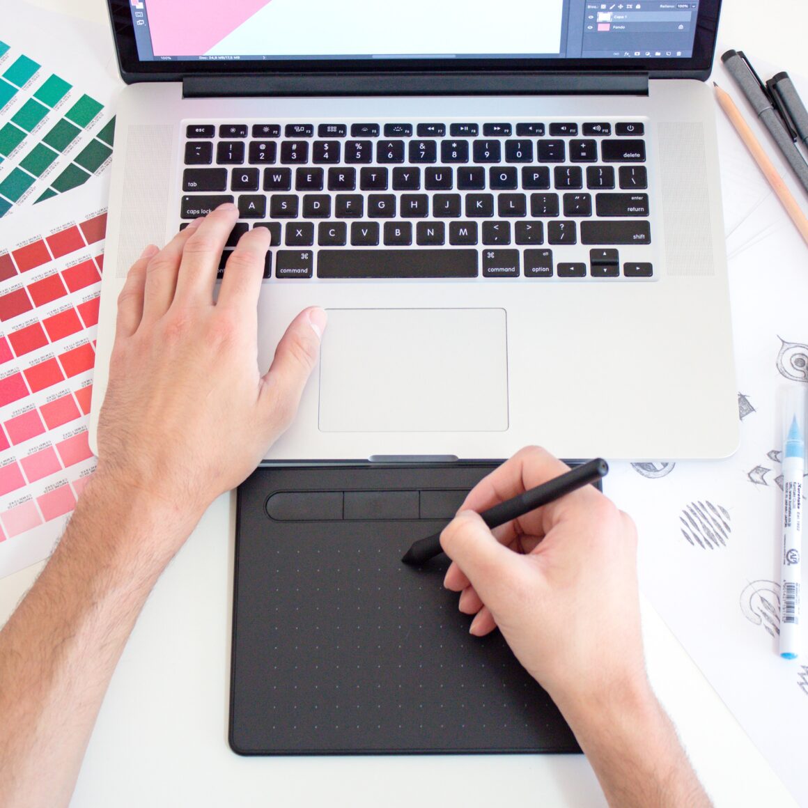
Visual communication has always played a crucial role in the way brands connect with their audiences. Though trends have changed, advertisements of some sort have always been a key element of business success. How else would you let people know about your product or service? With that said, digital design in marketing is much younger than print design. This “newer” avenue of consumer connection borrows heavily from its older sibling, but introduces plenty of its own signature features to the mix.
Understanding the distinction between print and digital mediums in design is a must these days if you want to truly utilize each to its fullest potential. Which one is more appropriate for your marketing goals? Whether you’re making a brand update, launching a product, or initiating a huge campaign push, here’s what you need to know about these two kinds of design that are hugely similar and different at the same time.
What Is Print Design?
This kind of design encompasses any visual material that is physically printed and distributed. It’s been around for ages. Printmaking began as far back as 206 B.C. when the earliest known example was created. If we’re only counting paper printing, though, that’s been around since the seventh century. Needless to say, the art has a long history, which is a testament to its staying power. In essence, it’s a core foundation of graphic design.
Common formats include:
- Flyers and brochures
- Banners and posters
- Business cards
- Product packaging
Important considerations:
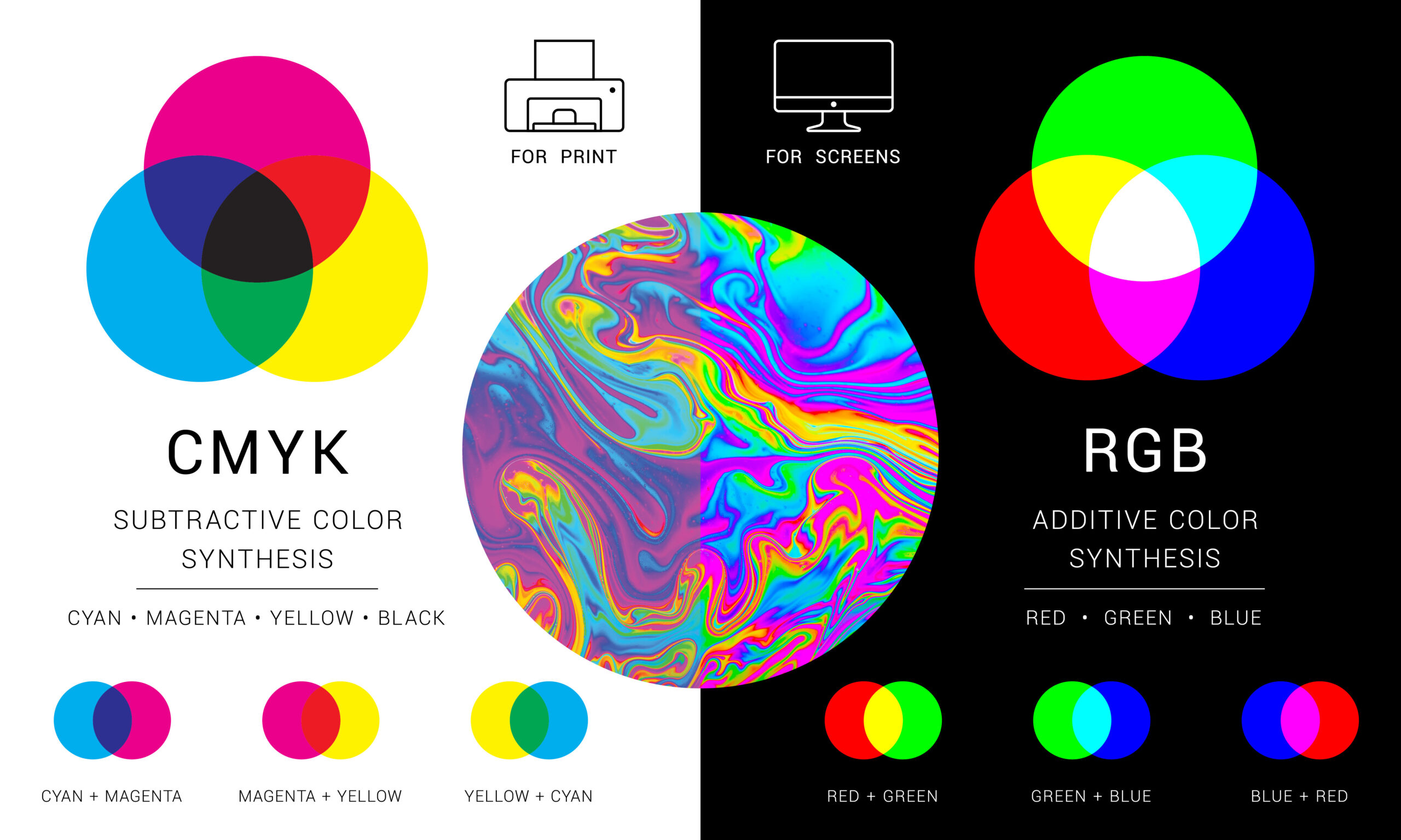
- Resolution: Print requires higher resolutions than its digital counterpart. For print clarity, a resolution of at least 300 DPI (dots per inch) is needed.
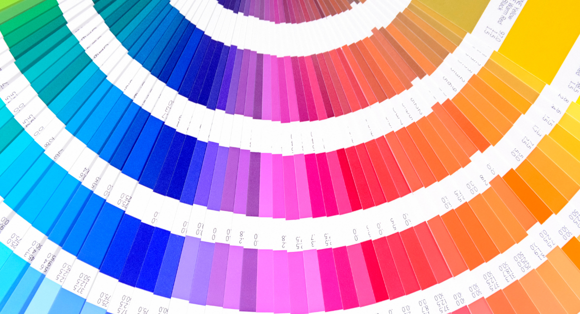
- Color Mode: The standard color mode for print pieces is CMYK (cyan, magenta, yellow, black).
- Physical Dimensions: If you’re designing a print piece, you need to keep bleed, trim, and safety margins in mind. Furthermore, if you’re designing a larger piece such as a booklet, you need to consider spreads and binding. How should everything be designed in order to come together neatly when the physical piece is assembled?
Fun fact: You may have noticed that the “K” in “CMYK” stands for “black,” a word that definitely does not start with a “K.” That’s because, technically, the “K” stands for “key.” In old-school printing, the printing plate that contained the most detail was referred to as the “key plate,” which was typically black. The more you know…
What Is Digital Design?
This is the kind of design that you see everywhere if you love your mobile devices and computers. Heck, you saw it in your search engine layout on your way to this very blog, and you see it on this very page! That’s because digital design refers to visual content that is made specifically with screens in mind. It incorporates plenty of print design elements, like current layout trends, popular typefaces, and more, but it offers so many more features than that.
Digital design frequently incorporates motion and interactivity, creating a dynamic experience for the user. On top of that, the possibilities around the dimensions of a digital piece are nearly endless.
Common format include:
- Websites and mobile apps
- Digital ads
- Social media graphics
- Email newsletters
Important considerations:
- Screen Resolution: Screens don’t require resolutions as high as print pieces, and they’re optimized for DPI in the 72–150 range.
- Color Mode: Screen-based work uses the RGB (red, green, blue) color mode.
- File Sizes: Files need to be optimized to be as small as possible without compromising the quality of the visuals. This is one reason a resolution lower than print is so important. The smaller the file size, the better the loading and performance on your screen.
- Interactivity: Hover states, clickable elements, animations, and more are made possible by digital pieces, providing an enhanced user experience.
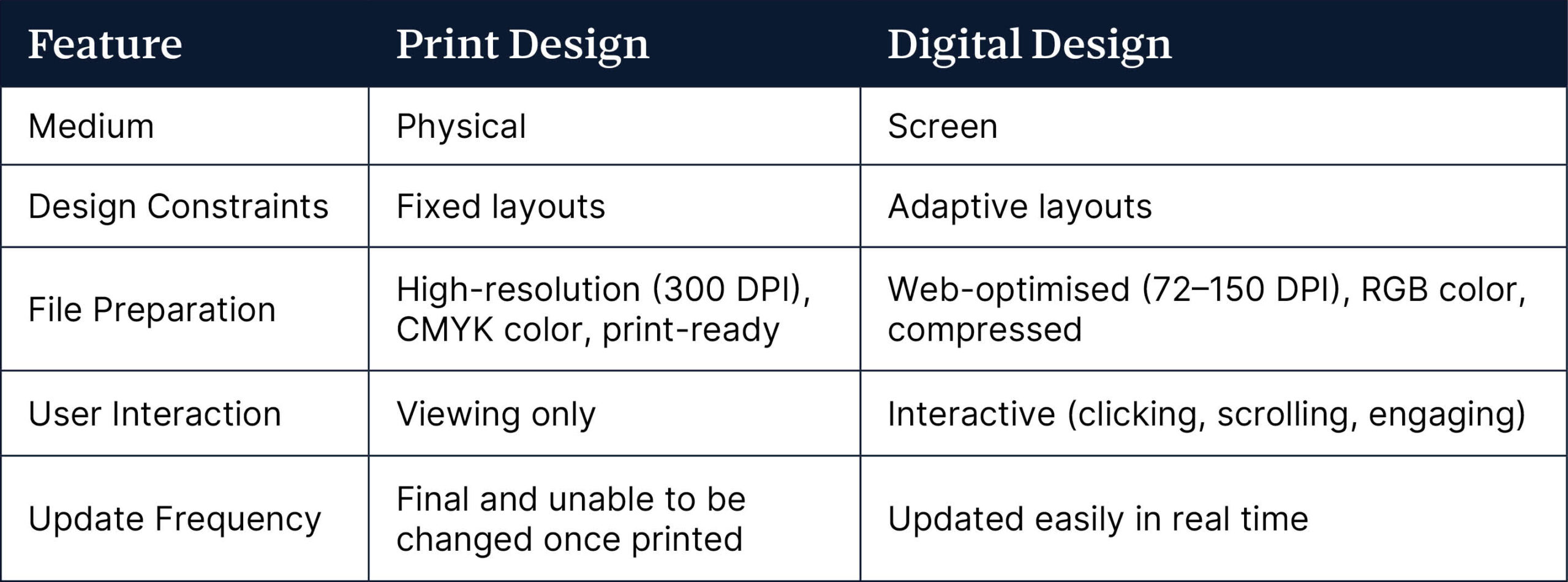
Key Differences Between the Two
We don’t expect you to keep jumping back and forth between the two previous sections to figure out all the differences between these two design arenas, so we’ve put together a handy little chart for your reference.
When to Use Each Type
Both digital and print design have their place and plenty of staying power in the realm of marketing, and which one you choose depends on your audience and goals.
Use print when you want to create:
- Signs or physical stationery like business cards or brochures
- Direct mailers or marketing materials for events
- Something you want people to take with them
Use digital when you want to create:
- A website or social media presence
- Content that can be updated regularly or formatted for various devices
- User engagement through interactive elements
Need a Print or Digital Designer? We’ll Cover Both!
Much like yin and yang, print and digital design are wildly different aspects of marketing that each make up a vital part of the big picture, with each piece carrying a small element of its counterpart. Understanding those key differences—resolution, color, medium, and interactivity—gives you the power to concoct an effective visual marketing strategy that supports your brand.
At ArachnidWorks, our team has a firm grasp on both aspects. Whether you need your event to be perfect with printed posters or you want your website to stand above the competition, we’ve got you covered. Get in touch with us and we’ll put a skilled print or digital designer on your project!