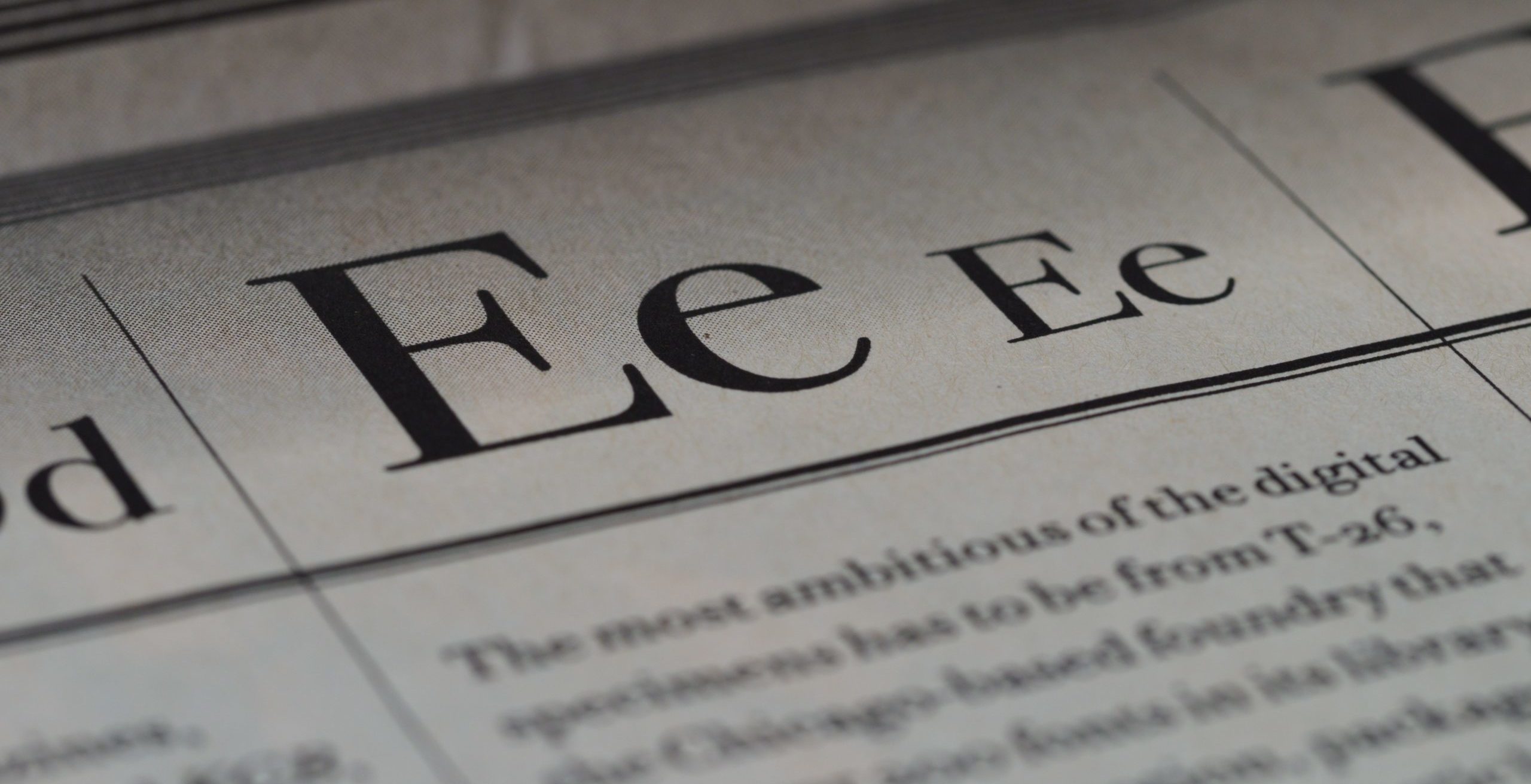
Want to hear a shocking fact? There are currently over 200 million live websites on the internet, and another 1.5 billion sites that are currently inactive. When it comes to your logo and web design, “good enough” just isn’t good enough. You need a style that sets you apart.
What makes a great, standout logo and website design?
A great logo needs to check these boxes:
- Relevant
- Simple
- Versatile
- Scalable in size
- Simple
- Engaging in both content and appearance
On the other hand, the secret to a great website is:
- Straightforward and easy to navigate
- Targeted to the right audience using the right words
- Full of high-quality imagery
- Consistent in style
- Engaging in both content and appearance
Notice anything similar with these concepts? The secret includes an engaging appearance.
The best place to start creating an engaging appearance and the perfect logo and website designs? Choosing a Google font for your logo, web, or print project.
According to the creative website design pros at ArachnidWorks, here are five of the best Google fonts for logo and web design.
Rubik:
Rubik is a timeless, versatile font designed to emphasize your headlines. It was originally designed by Hubert and Fischer for the exhibition, “Beyond Rubik’s Cube” in Jersey City.
Rubik is a sans-serif font featuring rounded corners. It’s in the 5-weight family, and includes italic and roman styles.
To see this font in action, visit this page.
Playfair Display:
This John Baskerville-inspired font is playfully elegant, and flexible enough to use in a number of design applications. Playfair Display and its sister font, Playfair Display SC, can be used as a bold heading style and work nicely with Georgia in the text body.
Playfair Display includes discretionary ligatures, common ligatures, and small caps. You can take a look at this versatile font here.
Oswald:
Oswald, designed by Vernon Adams, Kalapi Gajjar, Cyreal Oswald was designed for use across the internet on desktop computers, mobile devices, and laptop web browsers on desktop computers.
Oswald, updated with a variable Weight axis in January 2019, is a reworking of the “Alternate Gothic” sans serif typefaces. It’s a font that can be read easily across multiple digital platforms with a sleek, impactful design to make your words jump off the pages. Check it out here.
Delta Gothic One:
With its thick, flat gothic body typeface, Delta Gothic One is a great choice for an impactful headline in print and packaging pieces. Designed by Aratakana, Delta Gothic One features strong geometric characters and is known for stability and strength. To view it, visit this page.
Abril Fatface:
Designed by TypeTogether, Abril Fatface is just one member of the Abril typeface family. A unique mix of thin serifs and curves makes it a fantastic choice for a bold statement. Inspired by the titling fonts used in 19th century France and Britain, this is an impactful, elegant headline choice. You can check it out here.
Ready to Make an Impact?
How does your logo or website stack up to the other 200 million sites? Try a redesign with one of these fonts, or contact ArachnidWorks and let us show you how to stand out from the crowd with website designs and logos that get you noticed.