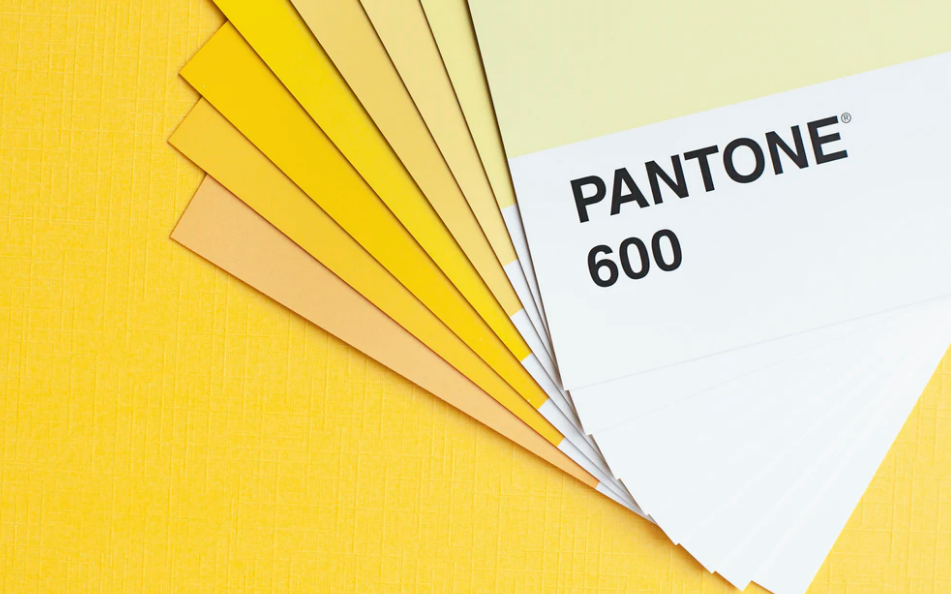
In the web offset printing process, colors are mainly replicated one of two ways; Pantone Matching System (PMS) or process color. When you are in the process of creating a print campaign, understanding the differences are critical to ensure the best quality.
Also known as “4cp”, process color is achieved by laying down the familiar cyan, magenta, yellow and black on top of each other in a particular sequence to produce an image. Pretty much any publication you see, including magazines and catalogs, are produced using process color. When looking at one of these printed pieces through a magnifying glass or loupe, one will notice the thousands of arranged little dots that make up the image that is seen.
A Pantone Matching System (PMS) color, commonly known as a “spot” color, is an ink color that exactly replicates the intended color. When there is zero room for color variance (such as with a big brand like “Ford blue” or “Heinz red”), PMS colors are used. PMS colors have numbers associated with them which can be referenced in Pantone color guide. When choosing a PMS color, one can be certain that the selected color will look the same every time.